Mixed Media Cards with Grungy Butterflies and Antique Botanicals
Good morning, Ellie Knol here..
I made 2 cards for you today, showcasing what a difference color makes on a background and focal point.
I’ve used some leftover backgrounds from a post back in November 2022.
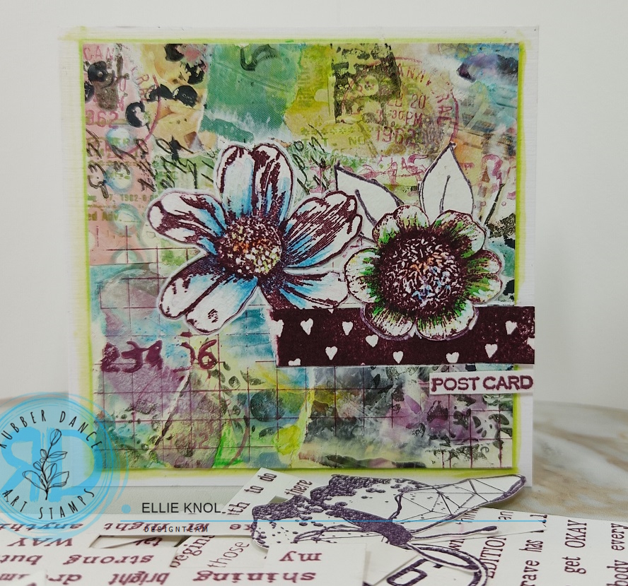
In that post I made ATC’s with an uncolored focal point. It would look like the card below : no color on the main image vs. color added to the image:
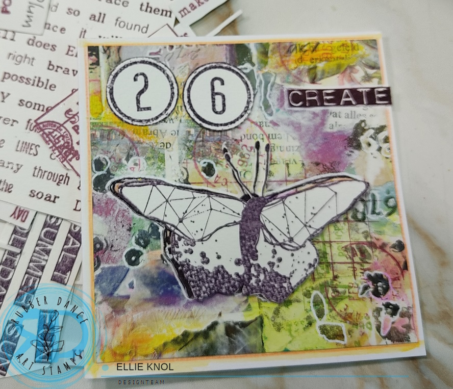
I went a step further… not just coloring, but choosing 4 different colors from the background to color the main images. Purple and orange on the card above, green and blue on the card below:
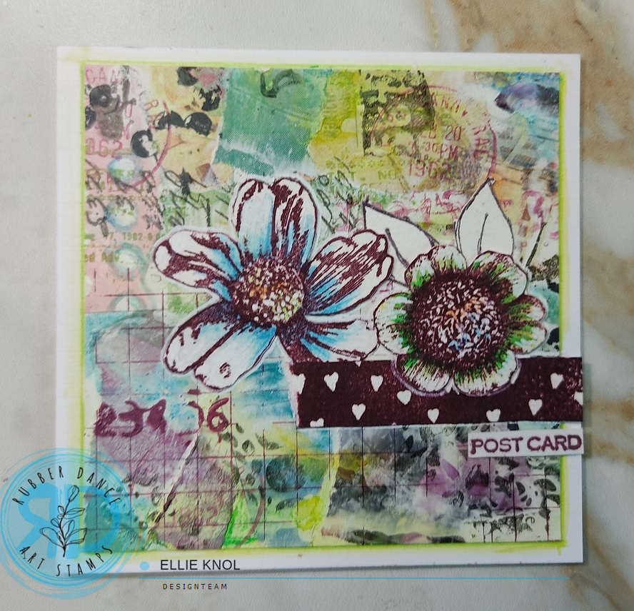
Just so you can see the cards together : it makes a huge difference as to what colors get used on the main image as it makes the colors used in the image pop more in the background.
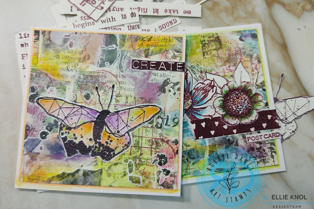
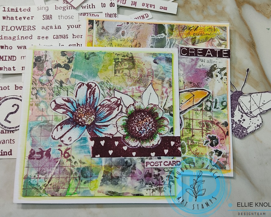
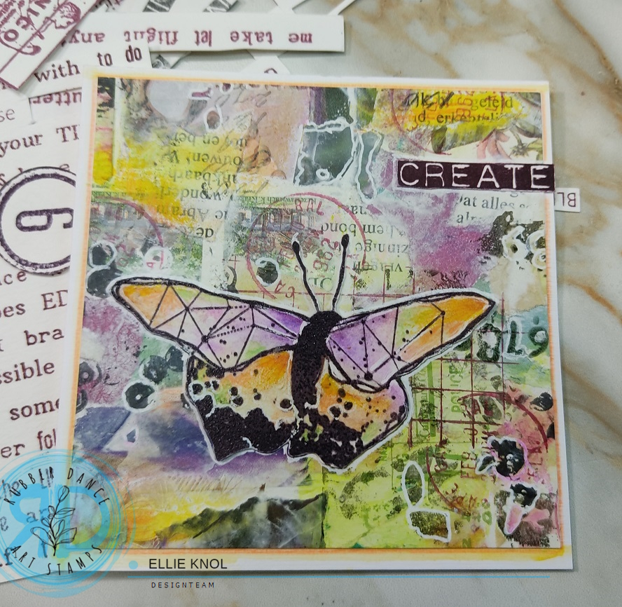
Enjoy some more pictures:
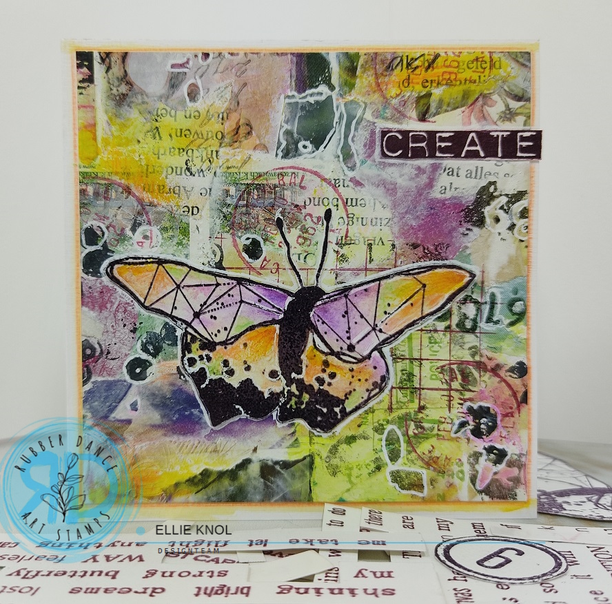
I always get more depth when photographing the projects upright with a light source on the left, in a light box. ..
That’s it for today, I hope you got inspired by my two cards to explore color.
Please share it with us in the FB group and have a chance at winning some product from the shop as we have an ongoing challenge with an extra moodboard if you like to use itIt is basically a anything goes challenge though, you do not have to use the colors of the moodboard.
Come join in the fun and be inspired by our lovely design team!
See you next time.
Ellie Knol.
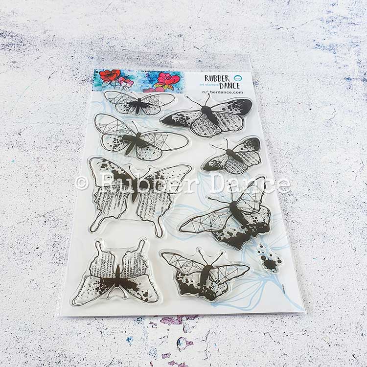
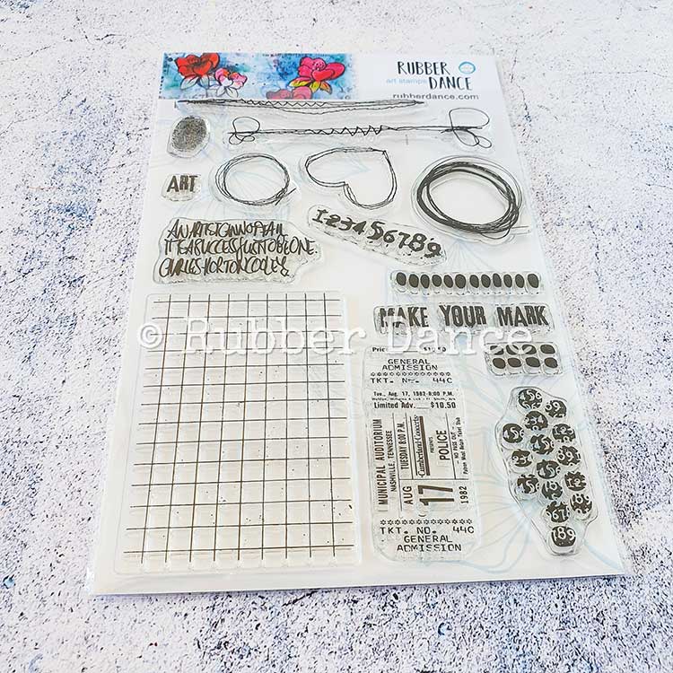
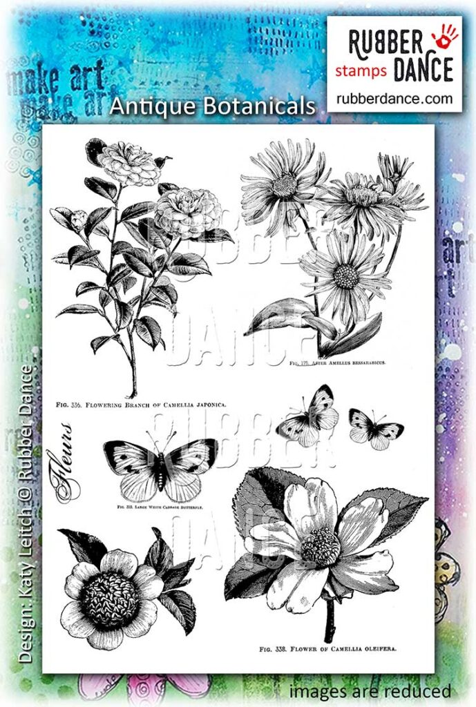
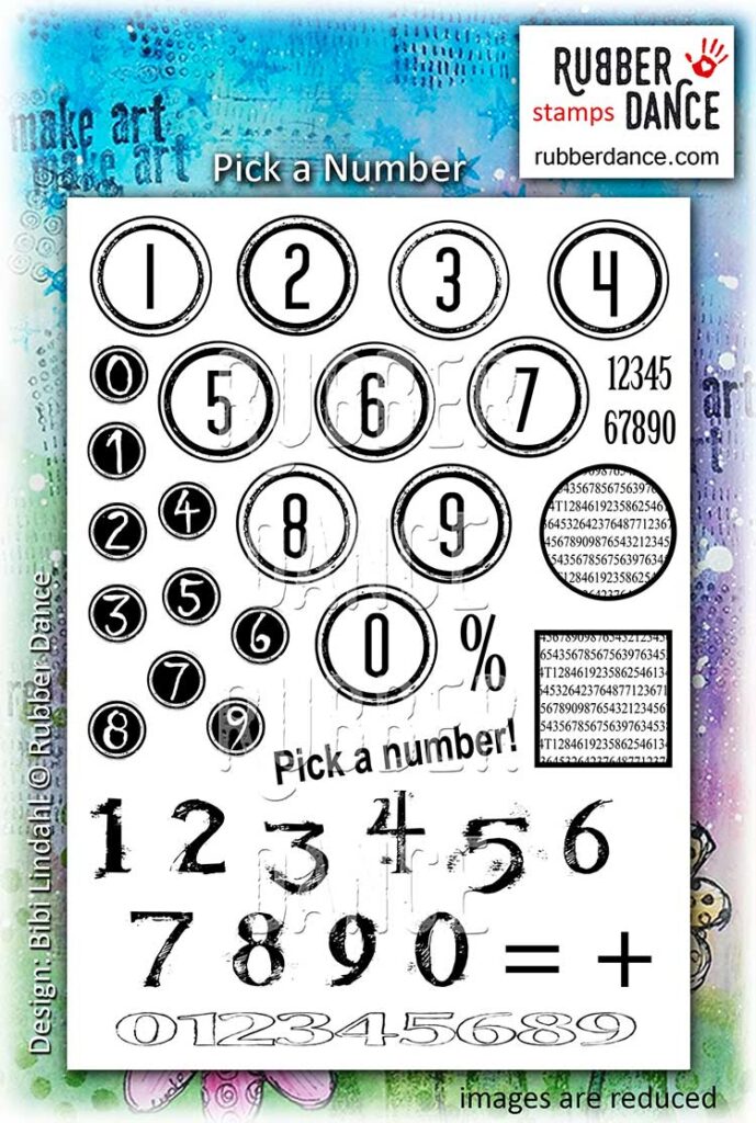
I used these stamps from the Rubber Dance collection of stamps:


Comments are closed for this post.